Creating Our Brand: The Story Behind The Dobbs Group’s Marketing Evolution
By way of introduction, I am the Director of All Things Beautiful with The Dobbs Group; I chose “beautiful” for my title because marketing and brand development are now more magical and creative than just a slick print ad or snail mail postcard.
The past informs the present in many ways…
1.) In the history of advertising, the first-ever written ad was found in the ruins of Thebes in Egypt. It was a Papyrus created in 3000 BC by a slaveholder trying to find a runaway slave while also promoting their weaving shop and 2.) The first newspaper advertisement was published in 1704 in the United States. Then in the early 1800s, billboards came into existence, and brands began to leverage them to express their value propositions. And then digital advertising was born…
Debra has always been ahead of the curve when it comes to marketing. Before beginning her real estate career in 1984, Debra worked for one of the most respected advertising firms in the country then opened Chicago’s first gelateria…talk about getting the word out about a product no one had heard of.
Debra was also ahead of the curve in developing her brand and marketing strategy when she started her career in real estate. Especially in the service industry, creating one’s brand is symbiotic with the client experience. A respected brand cannot exist without clients who respect the person behind the brand and have an outstanding experience that exceeds their expectations. At the core of our brand is the client and providing them with just such an experience.
As a real estate agent (versus brokerage company), Debra was a pioneer in developing a custom website and harnessing the power of Search Engine Optimization to promote her listings and her brand.
In 2014 I approached Debra to discuss revamping her brand and website design. So many tips for creating a real estate website, and all are so vanilla. I wanted to create a comprehensive brand package that was beautiful, engaging, and authentic to who Debra is at her core; smart, fierce, creative, engaging, and playful. I wanted Debra and our team to stand out from the usual black and white initials with a key or house image. I wanted our visuals to communicate our shared values to the internet world and beyond.
The Dobbs Group brand – who we are and our core values:
– we are fierce advocates for the best interests of our clients
– we adapt and evolve in an ever-changing real estate market, through education, initiative, passion, and respect for our team members, our colleagues, and our clients
– we strive to deliver exceptional results to optimize the value of the client’s property
– we are authentic, transparent, and accessible
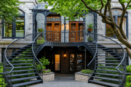
– we share a deep knowledge of and love for Chicago
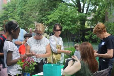
– we are good neighbors, supporting local businesses within our core neighborhoods, and active participation in our local community organizations
– we are empathetic, generous, and playful – we love what we do, and it shows!
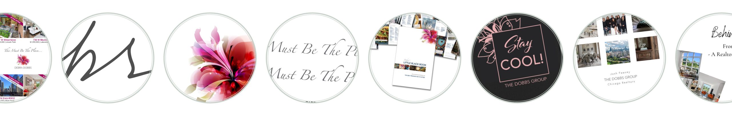
The Logo – an expressive and unapologetic anchor of the visual design
![]()
We spent many months working on our logo. Debra is a balanced mix of all business with a playful, curious, and creative side. I had to capture that balance, along with our core values, and as artistic director, what I believe to be the fundamental design elements for a superb logo:
Simplicity – Memorability – Originality – Modern Yet Timeless – Balance – Complementary – Versatility
The logo’s bright colors, easy distinguishability, and a certain “otherness” represent our effort to communicate that we are a collective of agents with a slightly different approach to marketing than is common among other real estate agents. Our goal in design is to be fresh, original, and show a bit of quirk. The pink flower that is the cornerstone of the logo communicates joy, enthusiasm, and something of feminine strength – because our leader is Debra Dobbs, a passionate women’s rights advocate and fierce protector of her family, friends, and clients; a client nicknamed Debra ‘The Lioness’.
I’ll admit that we debated whether such a logo could be perceived as too ‘girly,’ but in the end, we agreed that this was instead its strength; the logo communicates the creative, out-of-the-box personal style a client will encounter when they work with us.
Website structure – beyond essentials
We knew the website had to contain all the elements a visitor expects, but we also wanted to bring a bit of surprise that reveal our shared identity and the stories behind us.
That’s why we included in the structure, for example, “Debra’s Story,” a partially animated page in a cartoonish style that shows Debra’s life journey, from the south side of Chicago to Italy and back to Chicago, with many adventures and milestones along the way. The culmination of that journey is the discovery of a profession that has become Debra’s lifelong passion.
The Debra by the Numbers page shows countdown numbers on how we are doing professionally (how many deals we closed in a year and how many clients we worked with). But it also features some numbers from our personal lives – how many bottles of champagne are consumed in Debra’s household each year (quite a few), how many pets we currently have (4 in The Dobbs house and 7 across the team), and other fun facts about us.
We paid particular attention to the content of our Chicago neighborhood pages. We wanted visitors to find authentic information based on our personal experiences and insights, not just dry numbers and facts.
While we are very proud of our awards and felt that they should appear on the site in some form, the awards and accolades page is deliberately condensed. It communicates (we hope) that while we appreciate being honored, we are not driven by awards. The best ‘award’ is a glowing testimonial from a delighted client.
Our website showcases a great deal of educational and informative content. For first-time homebuyers, we dedicated a special page where they can find the essential information they need at the start of their journey. We are working on a page for first-time home sellers, recognizing that the path to buying a home is not the same as when you sell your home.
The aim of our website is to introduce us to you, but most importantly, to offer the broadest range of information, tips, and insights that can help any seller or buyer, novice or seasoned, to navigate the complex landscape of the Chicago real estate market.
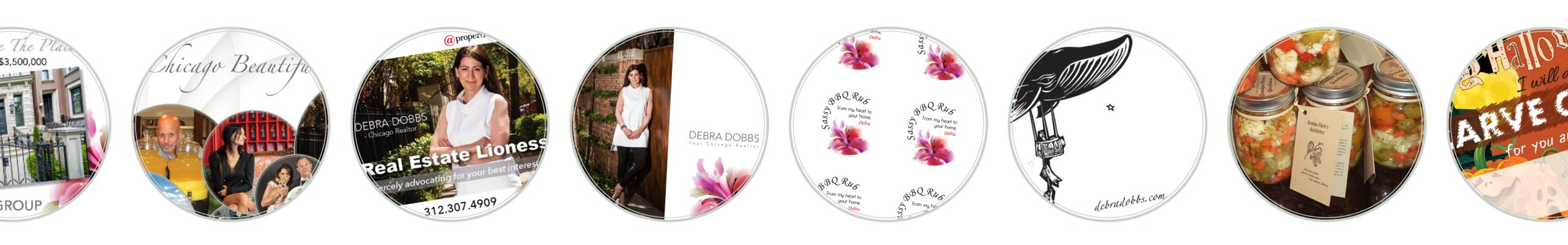
Communicate through visual style
- Sharp and clear photos with a full bleed and lots of white space communicate precision, attention to detail, and generosity.
- All pages on our website follow a consistent style that speaks to and further develops the logo’s motif and references its color scheme.
- Symmetry, the continuation of themes, smooth round elements, and the use of photographs that contain symmetrical circular elements refer to our inclination to seek balance and perfection.
- We never use full black in our marketing materials, only shades of grey. In doing so, we try to subtly express our view of the world as a place without dual injunctions, where the ability to see problems from all angles is crucial, and the ability to negotiate is the key to solving them.
Awards and Accolades for the website’s design
We are delighted to find that the creators of various lists have noticed our site, both those that deal with Chicago real estate agent sites and those that evaluate them in a national or international context. It feels good to be an inspiration to others!
Our work is a journey to constantly improve our website, both visually and technically. We just completed an extensive project that makes our site faster than ever. We are rebuilding our homepage to offer visitors superior navigation, informative content, and stories to compel you, as our prospective client, to hire us as professionals who love and excel at and love their work.
Eva